Direct Community Care is a compassionate and professional NDIS provider dedicated to delivering person-centred care to its participants. Their team is committed to providing ethical, reliable, and trustworthy services that ensure participants receive the highest level of support. By carefully matching team members with participants based on shared interests, hobbies, and personalities, Direct Community Care fosters meaningful connections and celebrates diversity.
With a focus on excellent service provision, the organisation offers specialised services such as Community Access, Personal Care, and Capacity Building, all designed to empower participants and deliver the best outcomes.
The Challenge: Modernising While Preserving Legacy
Direct Community Care approached us with a clear goal: to modernise their brand while retaining the core elements of their original identity. They wanted their new look to reflect the excellent service they provide and to take centre stage on their new website.
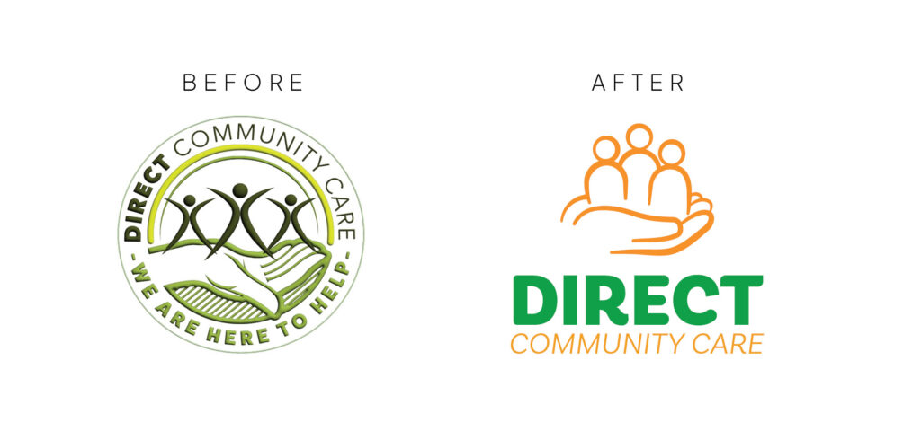
The challenge lay in balancing the old and the new. The original logo, featuring a hand cradling participants in support, was a key element they wanted to retain. Additionally, they were committed to keeping green as the primary brand colour. Our task was to refine and modernise these elements while creating a fresh, vibrant identity that would stand out in the competitive NDIS provider space.
The Approach: A Modern, Vibrant Identity
Our approach was to honour the essence of the original brand while introducing modern design elements that would make the identity more versatile, vibrant, and welcoming.
What We Created
The result was a refreshed brand identity that balanced legacy with innovation.
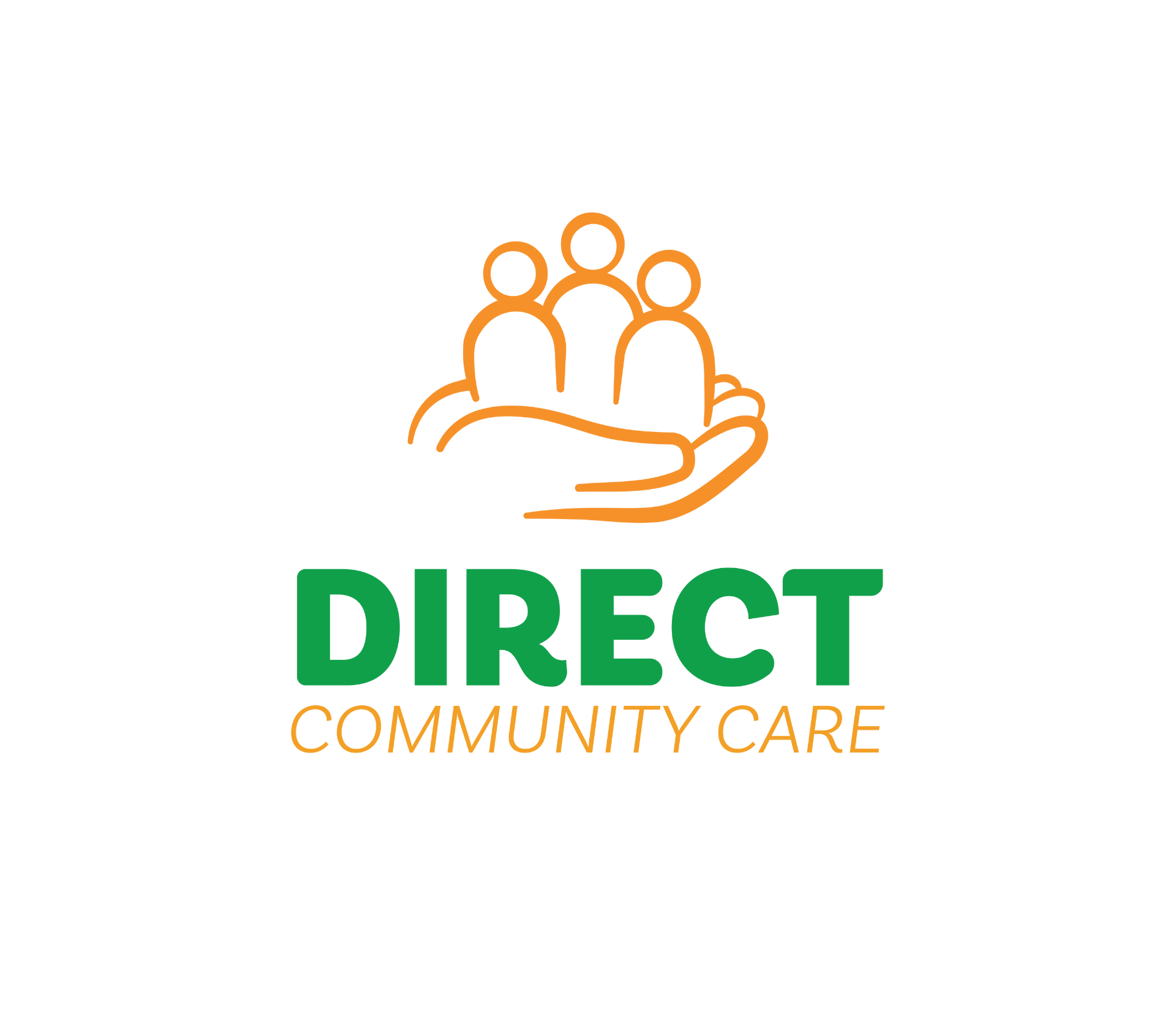
- Refined Logomark:
- We reimagined the original hand-cradling design, creating a smoother, more fluid illustration with simplified details. This made the logo more versatile and easier to reproduce at smaller sizes, ensuring clarity across all applications.
- The updated logomark retained the supportive and nurturing theme of the original design, staying true to the organisation’s values.
- Vibrant Colour Palette:
- While green remained the primary colour, we shifted it from an earthy tone to a more vibrant shade, giving the brand a fresh and modern feel.
- To complement the green, we introduced a tangerine orange, adding warmth, optimism, and a welcoming energy to the brand.
- Although green and orange are often associated with health food and produce, we found that this combination created a friendly and distinctive identity, setting Direct Community Care apart from other NDIS providers who typically use blues, purples, and pinks.
- Soft and Fluid Typography:
- We developed a custom typography style with soft, fluid lines and varying weights to reflect the organisation’s compassionate and approachable nature.
- The long business name posed a design challenge, so we opted for a stacked layout with an emphasis on the word “Direct” to ensure the logo remained eye-catching and easy to read.
- Brand Applications:
- We extended the new brand identity across various touchpoints, including the new website, marketing materials, and signage.
- The vibrant colour palette and refined typography created a cohesive and professional look that resonated with both participants and team members.
The Impact
The refreshed brand identity has transformed Direct Community Care’s visual presence, making it more modern, vibrant, and reflective of the organisation’s excellent service. The updated logomark and typography strike a perfect balance between legacy and innovation, ensuring the brand remains recognisable while feeling fresh and contemporary.
The introduction of the tangerine orange added a unique point of difference, helping Direct Community Care stand out in a crowded market of NDIS providers. The vibrant colour palette and welcoming design elements have resonated with participants, reinforcing the organisation’s commitment to person-centred care.
The new brand has also become a focal point of the organisation’s new website, creating a strong first impression and enhancing the overall user experience.
Conclusion
The Direct Community Care brand refresh is a testament to the power of thoughtful design in modernising a brand while preserving its core identity. By refining the original elements and introducing vibrant, welcoming design choices, we created a brand that reflects the organisation’s values and sets it apart in the NDIS provider space.
Direct Community Care’s new identity is more than just a visual update—it’s a celebration of their commitment to supporting and empowering participants with compassion, professionalism, and excellence.