About the Client: Mexi Shack
Welcome to Mexi Shack, where every bite is a celebration of bold flavors, fresh ingredients, and authentic Mexican recipes. From sizzling fajitas to cheesy nachos, Mexi Shack brings the fiesta straight to your plate.
More than just a restaurant, Mexi Shack is a celebration of flavor, family, and community. Inspired by the rich traditions of Mexican cuisine, the brand was born from a deep love of food and the joy it brings to life’s moments, big and small. Its story is rooted in family, with the founder growing up in their parents’ Mexican restaurant, surrounded by the aromas of fresh ingredients and the warmth of a close-knit community. Now, alongside their nephew, they’re continuing that legacy, creating a space where tradition, family, and flavor come together.
The Challenge: Standing Out in a Competitive Market
Melbourne’s food scene is vibrant and diverse, with a highly competitive market for Mexican cuisine. Mexi Shack needed a brand identity that would not only stand out but also celebrate its unique story—a family legacy of Mexican cooking, blending old and new traditions.
What began as a simple request for feedback—“Can you just take a quick look and give us some suggestions?”—quickly evolved into a full-scale brand rollout. The challenge was to create a brand that captured the excitement, celebration, and joy of Mexican culture while offering something fresh and different from what was already on the market.
The Approach: A Fiesta in Every Detail
")
")
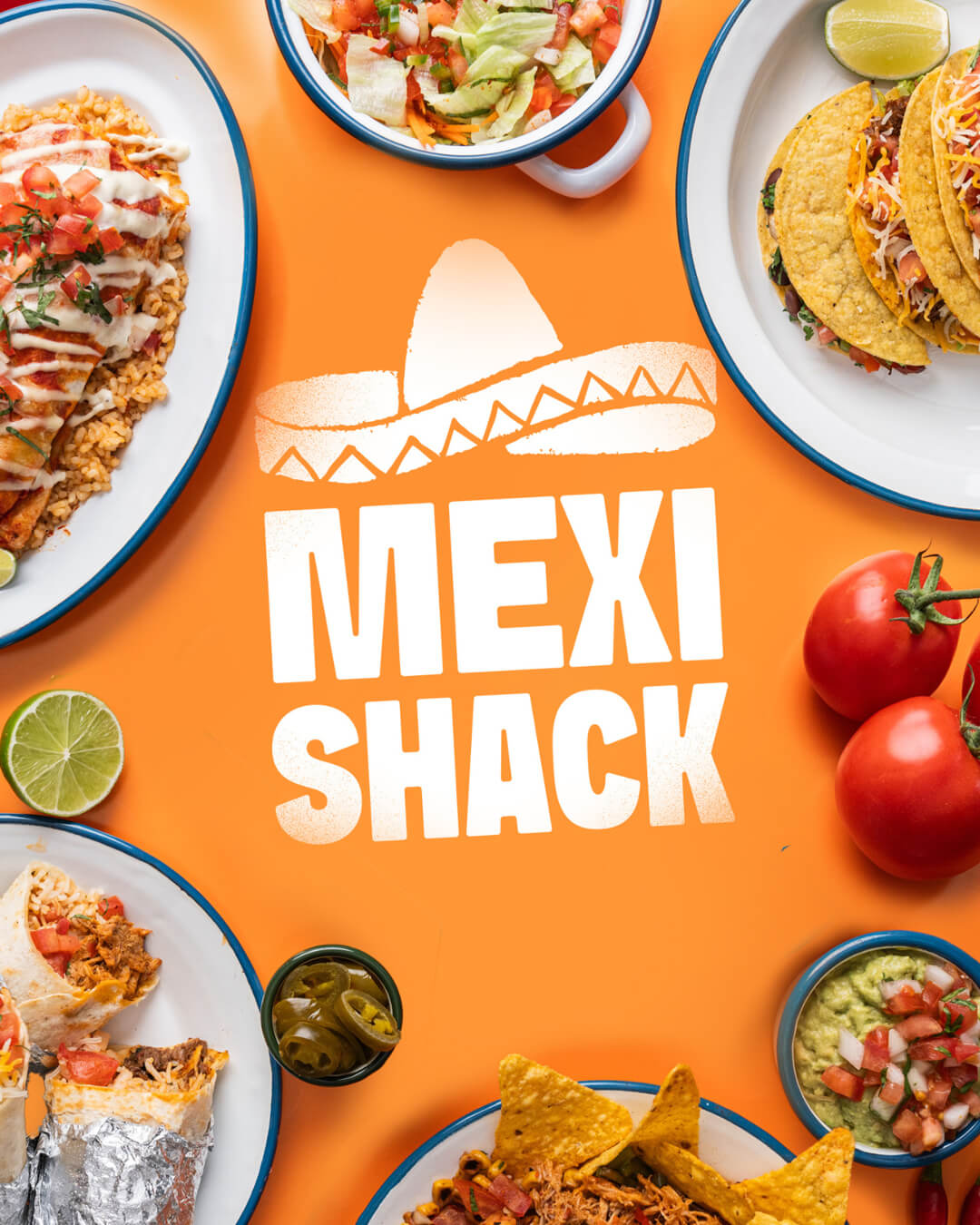
To differentiate Mexi Shack, we leaned into the idea of a fiesta—a celebration of life, food, and community. The goal was to create a brand that radiated excitement, joy, and the vibrant spirit of Mexican culture, all wrapped up in a meal.
What We Created
The result was a bold, energetic brand identity that brought the Mexi Shack story to life.
- Energetic Typography:
We designed typography that was dynamic and full of life, breaking away from rigid rules to reflect the fun, celebratory energy of a fiesta. The typeface became a key element in conveying the brand’s personality—playful, inviting, and full of movement. - Vibrant Color Palette:
While the owners initially wanted to use purple and yellow, we refined these colors to be more vibrant and added a bold emphasis on orange. The palette was inspired by traditional Mexican artwork, creating a warm, inviting, and authentic feel. - Patterns and Textures:
We incorporated traditional Mexican patterns and textures into the branding, blending them seamlessly with the typography and color palette. These elements added depth and authenticity, creating a visual identity that felt rich and celebratory. - Photography Moodboards:
To ensure the brand’s visual storytelling was consistent, we created moodboards for the photographers. These guided the creation of imagery that captured the delicious atmosphere of Mexi Shack—vibrant, colorful, and full of life. - Restaurant Fitouts and Signage:
Beyond the core brand, we extended our work to include mockups for restaurant fitouts and shopfronts. This helped the interiors team establish a cohesive direction for the space, from exterior signage to paint and artwork. The result was a physical environment that felt like an extension of the brand—warm, inviting, and full of fiesta energy. - Creative Assets:
We developed a suite of creative assets for Mexi Shack, including:
- Poster designs
- Menu artwork
- Promotional signage
- Packaging mockups
- Social media content
These assets ensured the brand could maintain a consistent and engaging presence across all touchpoints, from in-store experiences to digital platforms.
The Impact
The Mexi Shack brand rollout transformed the restaurant into a standout destination in Melbourne’s competitive Mexican food scene. The vibrant, fiesta-inspired identity not only captured the essence of the brand’s story but also resonated with customers, creating a sense of excitement and community.
The cohesive branding extended beyond visuals, influencing the restaurant’s physical space and customer experience. From the bold signage to the colorful interiors, every detail worked together to create an unforgettable atmosphere.
The new identity positioned Mexi Shack as more than just a place to eat—it became a celebration of flavor, family, and tradition, offering customers an experience that was as joyful as the food itself.
Conclusion
The Mexi Shack brand rollout is a perfect example of how thoughtful design and storytelling can elevate a business. By diving into the unique story of the family behind the restaurant and embracing the vibrant spirit of Mexican culture, we created a brand that stands out, connects with its audience, and celebrates the joy of food and community.
Mexi Shack is now a destination where every meal feels like a fiesta, and every customer leaves with a smile.